How to Change the YouTube Studio Theme (and Fix a Too-Dark Dark Mode)
By The iamcreator.io Team · July 8, 2026
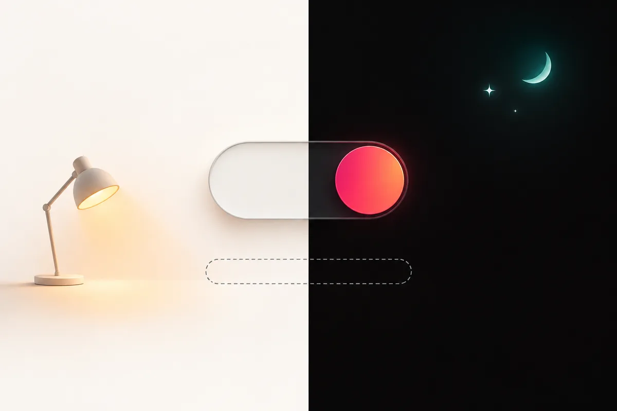
Changing the YouTube Studio theme takes about four clicks — and that’s both the good news and the whole problem. The setting is a blunt binary switch: light or dark, nothing in between. No dimmer, no contrast slider, no “match my system” option on desktop. If you landed here because Studio suddenly looks darker than you remember — or flipped to dark mode all on its own — you’re not the only one. Here’s the official setting, what we actually know about the 2026 darkening reports, and the workarounds that won’t compromise your dashboard.
The official way to change the YouTube Studio theme
The setting lives behind your avatar, not in the Settings gear where you’d expect it:
- Open
studio.youtube.com. - Click your profile picture in the top-right corner.
- Choose Appearance.
- Pick Light theme or Dark theme. The change applies instantly — no reload needed.
That’s the entire feature. Two options, per Google’s own help documentation. There is no intensity setting, no way to nudge the dark theme a shade lighter, and no scheduled switching. The YouTube Studio mobile app has its own separate dark theme toggle in its settings, so your phone and desktop can happily disagree with each other.
One more long-standing gripe worth naming: desktop Studio has historically not followed your system theme. The main YouTube site can track your OS preference; Studio makes you pick manually and then ignores whatever Windows or macOS says. Creators have been asking for a “use device theme” option in Studio for years — it still isn’t there. In practice that means if you run your OS on an automatic day/night schedule, Studio will cheerfully blast you with a white dashboard at midnight (or a black one at noon) until you flip the switch yourself.
Which theme should you actually use?
Beyond personal taste, there’s one genuinely practical reason to switch themes now and then: thumbnail review. Your thumbnails render against whatever background your viewers happen to use, and a design that pops against Studio’s light gray can turn to mush on a near-black feed. And remember that YouTube deliberately pushed its main dark theme toward near-black in 2022, so the dark end of the spectrum is darker than it used to be. Flipping Studio to dark theme before you finalize a thumbnail is a free, thirty-second preview of the worst-case viewing environment. Otherwise the usual ergonomics apply: light theme tends to read better in bright rooms, dark theme is easier on the eyes during late-night editing sessions — assuming the dark theme itself isn’t so dark it strains your eyes, which brings us to the next section.
Why Studio’s dark mode might look darker in 2026
Now the part that probably brought you here. Through mid-2026, creators have been reporting that Studio suddenly looks darker — or that it flipped to dark mode without them touching anything. One creator on X put it bluntly in June 2026: Studio was “suddenly showing me everything in dark mode... atrocious to look at” while the rest of YouTube stayed light. That mismatch — Studio dark, everything else light — is the recurring theme in the complaints, and it lands hardest on creators who picked light mode years ago and haven’t touched the setting since.
Here’s the honest status: there is no official announcement. YouTube’s creator updates changelog has no 2026 entry about Studio’s theme or appearance, so anyone quoting you a rollout date or an official reason is guessing. What we can say is that there’s a clear precedent. In October 2022, YouTube officially darkened the main site and app’s dark theme — announcing that “we’ve made our dark theme even darker so the colors truly pop” — shifting the background from gray to near-black. Based on creator reports, Studio appears to be drifting in the same near-black direction, just without the blog post this time.
Why does the distinction matter? Because your response depends on it. If this were an announced redesign, you’d know it’s permanent and plan accordingly. Since it’s unannounced and unevenly reported, the sensible read is: treat the darker look as likely here to stay (the 2022 precedent points that way), but don’t sink hours into elaborate fixes for something YouTube may still be actively tuning.
It also fits a pattern of Studio being actively reworked in 2026. The Content tab got a confirmed redesign around late June 2026 — a clearer “Notices” column and an estimated revenue column — and earlier in the year YouTube quietly removed the Likes column from the Content page with no announcement at all. Silent interface changes are, at this point, just how Studio ships.
Not the same as the Android dimming bug
So if Studio flipped dark on you, the first move is boring but correct: profile picture → Appearance → set it back to Light theme. If the setting already says light and Studio still renders dark, refresh, sign out and back in, and check again — uneven rollouts and glitches sort themselves out for some accounts and not others.
Troubleshooting theme weirdness
- Studio is dark but YouTube is light (or vice versa). Not a bug — they’re set independently. Studio’s theme lives in its own Appearance menu; the main site’s theme is a separate setting. Set both by hand if you want them to match.
- Desktop and mobile disagree. Same story: the Studio mobile app carries its own dark theme toggle in its settings, and it doesn’t sync with the website.
- The theme changed and you touched nothing. That’s the mid-2026 report pattern. Re-set it manually, and if it keeps overriding you, note that YouTube hasn’t published anything about it — you’re watching a rollout, not fighting a setting you missed.
- Videos look dark but the interface looks fine. That’s not a theme problem at all — see the callout above about the separate Android playback-dimming bug.
When the built-in setting isn’t enough: real workarounds
Say you want dark mode — you just want it less crushing. Since YouTube gives you no dial, the only path is restyling Studio in your own browser. Two approaches work, and both come with trade-offs you should walk into with open eyes.
Option 1: Stylus + custom CSS
Stylus is an open-source browser extension that applies user-written CSS to specific sites. Install it, add a style scoped to studio.youtube.com, and you can lift the background a few shades, soften the contrast, or recolor the whole dashboard however you like. It’s the maximum-control option.
You don’t need to be a developer to get value out of it. Even a handful of CSS rules — raising the main background from near-black to a dark gray, bumping text contrast on the Analytics tables — can turn an oppressive dashboard into a comfortable one. Community-shared userstyles for Studio exist too, so you can start from someone else’s work instead of a blank file.
The catches: those existing community userstyles are mostly old and may be stale, so expect to tweak CSS yourself. And any custom style breaks whenever YouTube changes Studio’s markup — which, as the 2026 redesigns show, happens regularly and without notice. A style you polish today can fall apart after next month’s silent update. Budget for occasional re-fixing, and treat it as a hobby project, not infrastructure.
Security first: Studio shows your money
studio.youtube.com can read the entire page — including your revenue, RPM, and analytics data. Only install trusted, open-source extensions. Stylus is open source and audited by its community; avoid the older “Stylish” extension, which had a documented data-collection scandal. When in doubt, keep extensions off your Studio tab entirely.Option 2: a Dark Reader-style extension
Extensions like Dark Reader take the opposite approach: instead of you writing CSS, they algorithmically re-shade whole sites and give you brightness and contrast sliders per site. For fixing a too-dark Studio, that means you can leave YouTube’s dark theme on and simply pull the brightness up a notch — or force a gentler dark mode over Studio’s light theme.
Trade-off: these extensions re-process every page render, and Studio’s Analytics screens are heavy — dense charts, live tables, constant re-draws. Expect a possible performance cost exactly where Studio is already at its slowest. If your Analytics tab starts stuttering, add Studio to the extension’s per-site off list and keep the adjustment for the lighter pages. And the same security rule applies here too: the extension can read everything on the page, so stick to well-known, reputable options with a long public track record.
Option 3: the zero-extension fallback
If installing anything on top of your revenue dashboard makes you twitchy — a reasonable instinct — there’s a cruder fix that costs nothing and touches nothing: run Studio in light theme and lean on your operating system’s display controls instead. Night-light / warm-color modes and plain screen brightness affect every app equally, need no page access, and can’t break when YouTube redesigns the DOM. You lose the aesthetic of dark mode, but for a late-night upload session, a dimmed light theme is often gentler than a crushed-black dark one anyway.
How the three options stack up
| Appearance setting | Stylus + custom CSS | Dark Reader-style | |
|---|---|---|---|
| Control | Light or dark, nothing between | Total — any color, any element | Brightness/contrast sliders per site |
| Safety | Native, zero added risk | Extension can read the page — open source only | Extension can read the page — reputable picks only |
| Maintenance | None | Breaks when YouTube changes Studio’s markup | Mostly automatic; occasional visual glitches |
| Performance | No impact | Negligible | Possible slowdown on heavy Analytics pages |
Our honest recommendation: start with the native setting and the zero-extension fallback. Reach for Stylus only if you live in Studio daily and the near-black background is genuinely wearing you down — and reach for a Dark Reader-style tool only on a machine where a bit of extra rendering work won’t hurt.
The bigger fix: spend fewer hours squinting at Studio
Here’s the question hiding under the theme complaint. If Studio’s colors are giving you eye strain, odds are it’s because you’re in there a lot — hopping between the Dashboard, per-video Analytics, the Engagement tab, and Advanced Mode to piece together whether your channel is actually doing well. The darkness isn’t the real tax. The hours are.
We’ve written before about how Studio keeps burying the signals creators actually check — the Likes column removal forced everyone into extra clicks for a number they used to read in one scroll. Theme churn is a smaller cut from the same knife: the dashboard keeps changing under you, without notice, and every change costs you a little more time and attention inside a tool you never chose to spend your evening in.
That’s the gap iamcreator.io closes. Instead of hunting numbers across half a dozen Studio screens, you get your channel’s key metrics — views, engagement, upload cadence, and a proprietary multi-factor Value Score for every video — on one screen, in one pass. Check it, read it, get back to making videos. Your eyes will thank you either way.
Your whole channel on one screen
Analyze your channel — or any public channel — free, no sign-up. Every key metric in a single view, so Studio marathons become Studio visits.
The channel analyzer works on any public channel, so it doubles as a competitor-research tool — and it pairs well with the rest of the best free YouTube tools in 2026 if you’re building out a lean toolkit. And if one of the numbers you keep opening Studio to check is your progress toward monetization, the monetization checker answers that in one look against the 2026 YouTube Partner Program thresholds — no dashboard spelunking, in any color scheme.
The short version
- Change the theme: profile picture → Appearance → Light or Dark. That’s all YouTube gives you — no slider, no system-theme option on desktop.
- Studio looks darker in 2026? No official word, but creator reports are consistent, and YouTube already darkened the main site’s theme to near-black in October 2022. Studio seems to be following suit, quietly.
- Want a middle ground? Stylus (open source, full control, needs upkeep) or a Dark Reader-style extension (easy sliders, possible slowdown). Never install a styling extension on Studio that you wouldn’t trust with your revenue page.
- Sudden flip to dark? Set it back manually first. If it persists with the setting on light, you’re inside an unannounced rollout — nothing you misconfigured, nothing to fix on your end beyond re-checking after a refresh.
- Long term: reduce the time you spend in Studio at all. With iamcreator.io, the numbers you keep digging for sit on one screen — whatever color YouTube decides your dashboard should be this quarter.
Frequently asked questions
How do I change the theme in YouTube Studio?
Open studio.youtube.com, click your profile picture in the top-right corner, choose Appearance, then pick Light theme or Dark theme. The change applies immediately. The YouTube Studio mobile app has its own separate dark theme toggle in its settings.
Why does YouTube Studio dark mode look darker in 2026?
There is no official announcement about a Studio theme change, and YouTube’s creator updates changelog has no 2026 entry about it. However, creators have reported Studio suddenly looking darker or flipping to dark mode in mid-2026. There is precedent: in October 2022 YouTube officially made the main site’s dark theme darker — moving from gray to near-black “so the colors truly pop” — and Studio appears to be following the same direction.
Can I make YouTube Studio’s dark mode less dark?
Not natively. The Appearance setting is a binary light/dark switch with no intensity or contrast slider. Your options are switching to the light theme, applying custom CSS via a trusted open-source extension like Stylus, or using a Dark Reader-style extension to adjust brightness and contrast per site — each with trade-offs in maintenance and privacy.
Does YouTube Studio follow my system theme automatically?
Desktop YouTube Studio has historically not followed your operating system’s light/dark preference — a long-standing creator complaint. You set the theme manually via profile picture → Appearance, and it stays that way regardless of your OS setting. The main YouTube site and the Studio mobile app handle theming separately.
Why did YouTube Studio suddenly switch to dark mode by itself?
In mid-2026, creators reported Studio unexpectedly showing everything in dark mode while the rest of YouTube stayed light. YouTube has not published an explanation. If it happens to you, the first fix is manual: profile picture → Appearance → Light theme. If the option is set correctly and Studio still renders dark, it is likely a rollout inconsistency worth re-checking after a refresh or re-login.
Is it safe to use browser extensions to restyle YouTube Studio?
Only with trusted, open-source extensions. Any styling extension granted access to studio.youtube.com can read the full page — including your revenue and analytics data. Stylus is open source and a reasonable choice; avoid the older “Stylish” extension, which had a documented data-collection scandal. Review permissions before installing anything that runs on Studio.